
VI & Signage
Nanjing
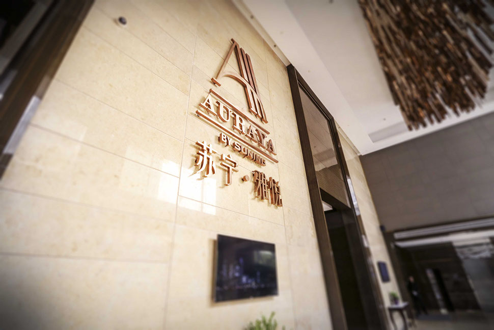
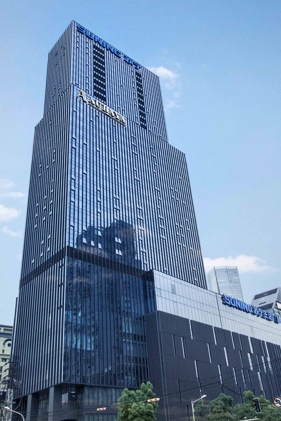
SUNING AURAYA SUITES is a high-end real estate project located in the heart of Nanjing city center. The key values of this brand are locked on classic, elegant and upper-class lifestyle.
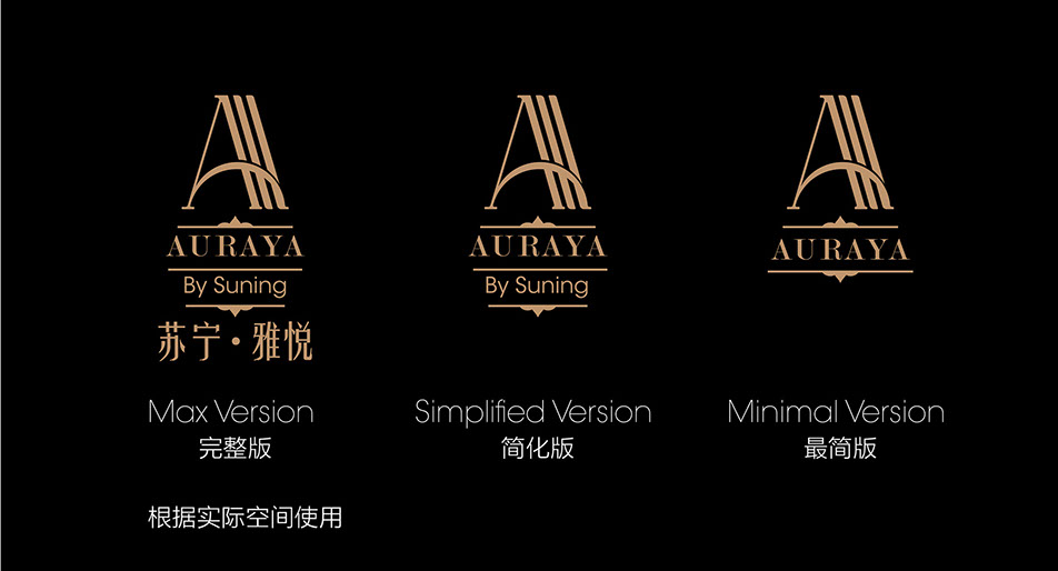
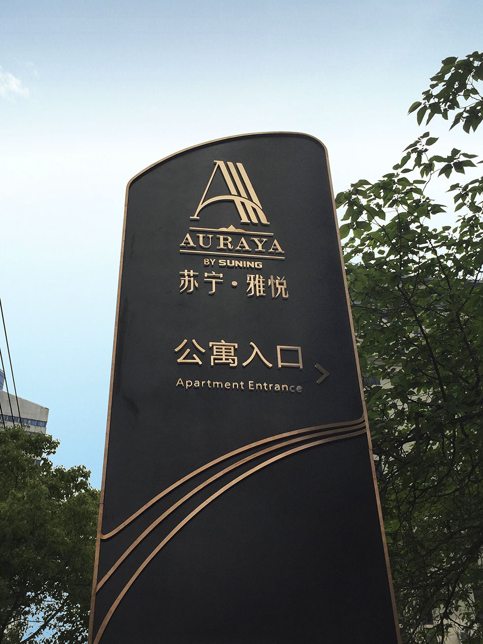
AURAYA, as an English & Chinese name, has many positive meanings to itself. Through several on-site survey and concept design, we introduced ART DECO to the design to meet key words of the branding identity. The logo we created is a graphic combination of the 3 “A” of AURAYA. Triple A conveys the information of offering a first class service. The design created keeps serifs to emphasize the ART DECO style. The curved beam from the A crosses the whole logo, and expresses that Suning AURAYA Suites is first place you will see the sun rising in the morning. “A” shape in itself is like the peak of a mountain and represents the top of the world. The whole logo looks pointing up, giving a meaning of aiming the top and chasing the perfection.
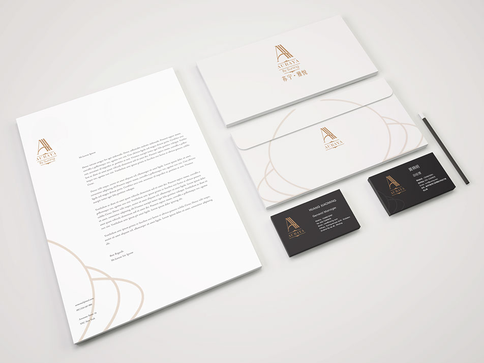
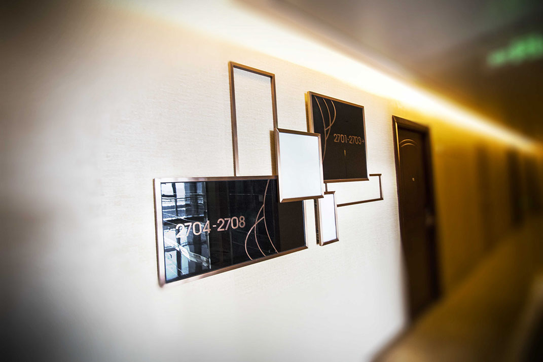
On the basis of logo design, we developed VI system and Signage following the same ART DECO Style. The scheme of color and material also maintain the same elegancy through combination of Gold & Black, Marble & Brushed metal.
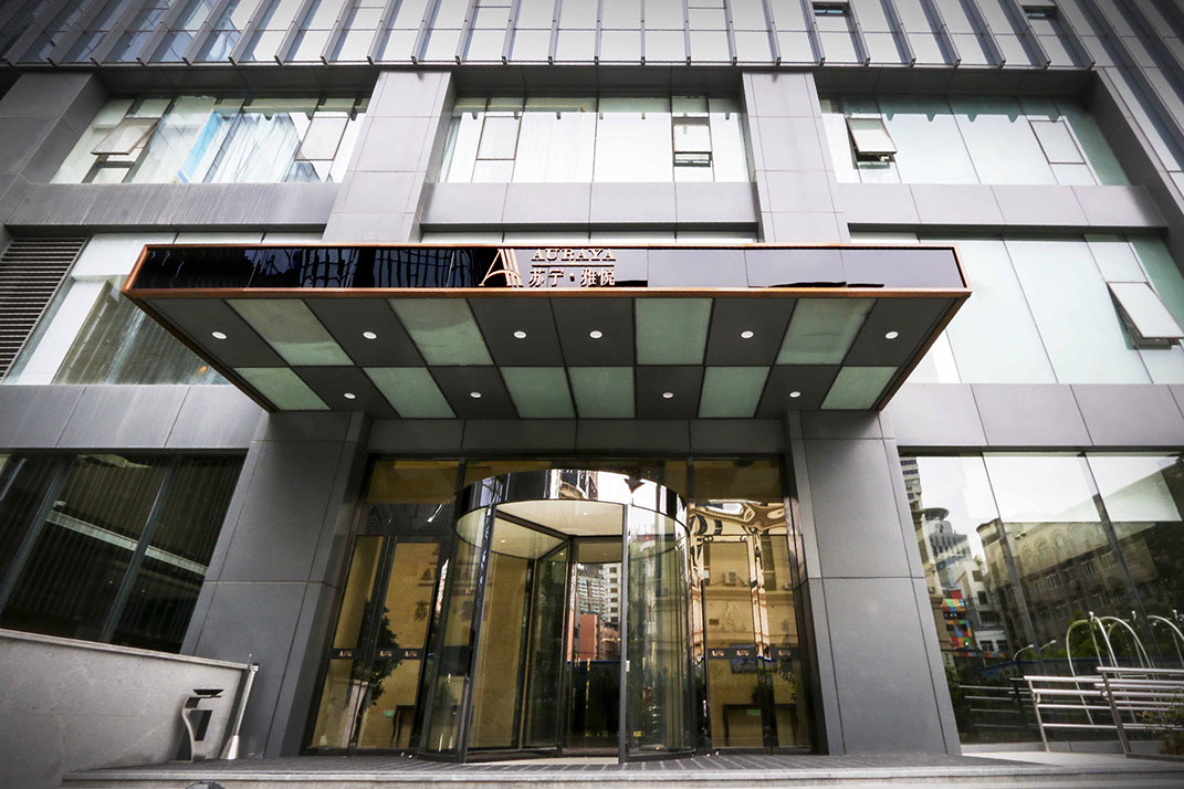
Eventually, the set of design has been approved by Suning Headquarters to be implemented throughout all locations of Auraya Suites projects.
2014 Copyright by Design Overlay. All Rights Reserved.